


Astronomers Map Milky Way in Incredible Detail
Astronomers have mapped atomic neutral hydrogen across the entire sky, creating an unprecedented portrait of our galaxy and some of its nearest neighbors.
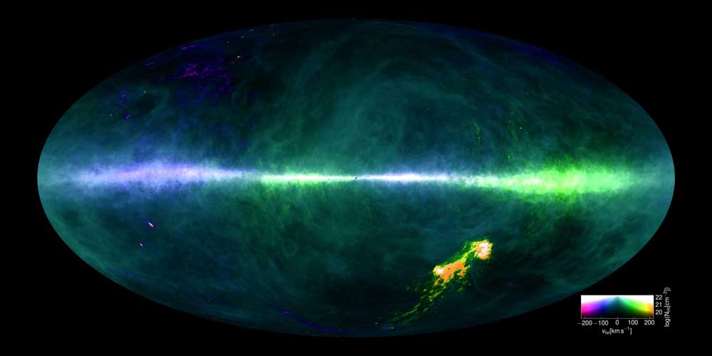
This map depicts the radiation from neutral atomic hydrogen (HI) across the entire sky, as seen by the Parkes and Effelsberg radio telescopes. Our galaxy, the Milky Way, appears as a luminous band across the sky with the Galactic Center in the middle. The Large and Small Magellanic Clouds are prominently visible in orange below the Galactic plane. They are surrounded by huge clouds of gas, forcefully disrupted from their hosts by gravitational interaction with the Milky Way. The HI emissions of the Andromeda galaxy (M31) and its neighbor, Triangulum (M33), are also easy to spot as bright purple ellipses in the lower left. The gas motion is color-coded to represent the gas's motion, and the visual brightness in the image relates to how much neutral hydrogen is present. Click for bigger image.
HI4PI Collaboration
HI4PI Collaboration
Hydrogen is the single most abundant element in the universe. The simple pairing of a proton and electron is so reactive that atomic hydrogen doesn’t occur naturally on Earth — it reacts with itself or other elements to form molecules instead. But in the large, mostly empty space between stars floats a copious amount of neutral atomic hydrogen.
We only know it’s there when the atom’s lone electron very occasionally flips from an “up” state to a “down” state, releasing a single 21-centimeter radio wave. Modern radio telescopes can easily pick up the faint signal, which multiplies thanks to the wealth of hydrogen atoms. What’s hard is to map that signal across the entire sky — and that’s exactly what astronomers have done in unprecedented detail.
Using two of the world’s largest fully steerable radio dishes, the 100-meter Effelsberg dish near Bonn, Germany, and the 64-meter Parkes dish west of Sydney, Australia, astronomers have generated a survey they’ve dubbed HI4PI. Pronounced “hi four pie,” the survey refers to the abbreviation for neutral hydrogen (HI) and the geometrical reference to the whole sky (4PI, or 4π).
Over thousands of hours on the sky, the dishes took more than a million individual observations. Thousands more hours went into processing dozens of terabytes of data, removing radio interference from broadcast stations, military radar, and other Earthbound sources, then stitching everything together into a seamless map of the hydrogen sky.
The resulting image is incredible: the ultrafine detail reveals fine threads and diffuse clouds in the interstellar medium never seen before. And for astronomers studying faraway X-ray or gamma-ray sources, the map will prove essential in cleaning the window to the distant universe.
The map shows not only the amount of hydrogen at each celestial location, but also the motion of hydrogen across the sky: the 21-centimeter radio signal shifts to slightly lower or higher energies as the hydrogen gas moves toward or away from us, respectively. Watch the video below to take a stepwise look through the data, seeing first the most negative velocities (infalling gas, moving toward Earth) and ending with the most positive radial velocities (receding gas from Earth’s perspective).
HI4PI data is available to scientists through the Strasbourg astronomical Data Center.
2 thoughts on “Astronomers Map Milky Way in Incredible Detail”