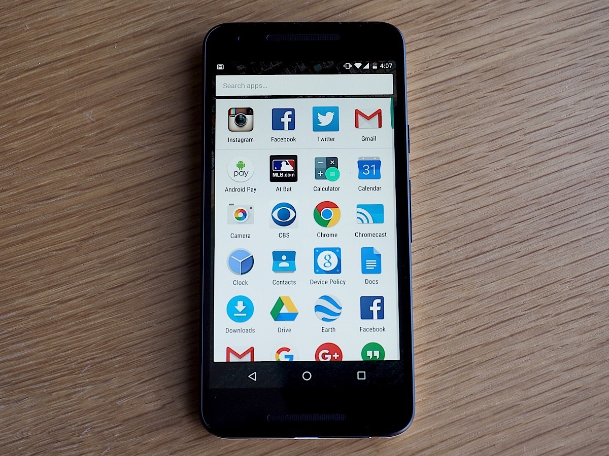
Google Now launcher forces Android apps to literally fit in
This Google Now update is for you, pedant.
Anyone wringing their hands over the fact that their Android apps just don't line up flush will be delighted with an update to Google Now's launcher -- the de facto home screen for Nexus-branded Android phones like the 6P. In response to the fact that some Android app makers aren't following Google's guidelines, those rogues, the company has taken it into its own hands, forcing consistent icon size inside the launcher. The main difference: oversized logos chill out a bit, shrinking to fit Google's in-house apps and third-party app icons that followed the rules.
The result is an app screen that looks a look more cohesive and less janky. The launcher works in horizontal mode too, with auto-rotate support baked into the upgrade. Now seriously, is there someone I can talk to about the kerning on that home screen?


No comments:
Post a Comment
Please leave a comment-- or suggestions, particularly of topics and places you'd like to see covered