Facebook Challenges YouTube Channels With New Features For Pages
Posted by Josh Constine (@joshconstine)
Next Story
Uber Adds A $2 Booking Fee To UberT Rides In NYC

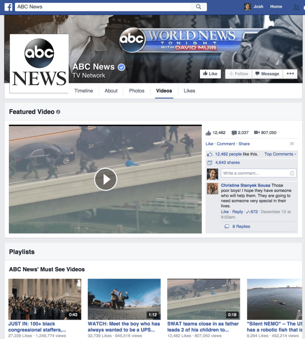
Twitter’s not the only one Facebook is battling for control of news and content distribution. With Pages getting quieted down in the feed, Facebook wants to make its home for businesses less like a newspaper that come to you and more like TV channels you turn on. That’s why it’s YouTube that’s getting flattered by the social network with a new design for the Video section of Facebook Pages.
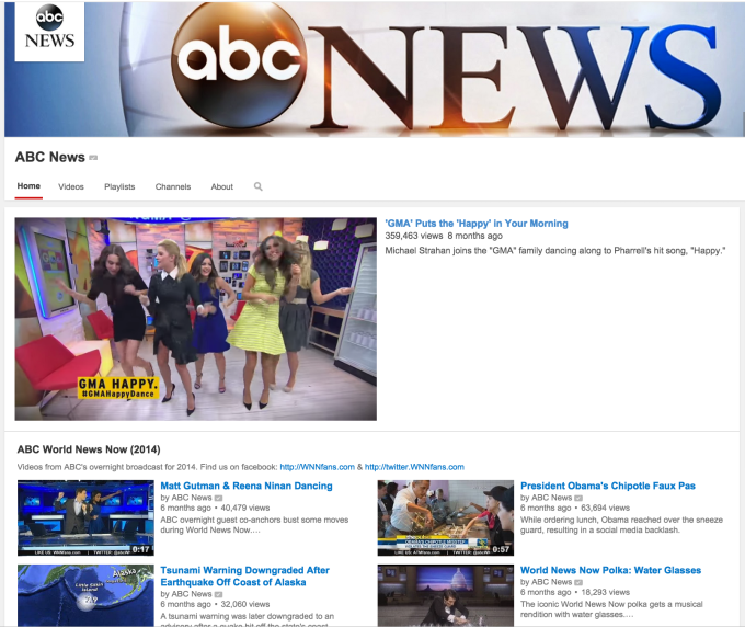
All businesses will soon be able to choose a featured video to be displayed extra-large with a live comment feed atop their Page, and cobble together playlists of more of their videos. This makes the Videos tabs of Pages look and feel a lot like YouTube Channels. TechCrunch spotted the new design and features on ABC News’ Page, and the company confirms it testing the format with a handful of Pages, and plans to roll it out to them all in the coming weeks.
Facebook’s video product changes come alongside pushes on the monetization front. It just struck a deal with the NFL to show football game highlights on Facebook with post-roll ads for Verizon. Ad revenue will be split by the league and tech company.
Teaching 1.35 billion old dogs new tricks is no easy feat, but Facebook is trying to turn Pages into destinations that business link to and people voluntarily visit. It’s a plot that sees Facebook fighting on all fronts. It’s given local business Pages contact details, reviews, and OpenTable integrations like Yelp. It’s opened communications channels and curation of evergreen content to compete with Google indexed websites. Now it’s poking at YouTube and television.

Current YouTube Channel design with…Featured Videos and Playlists
Pages will get the new design automatically. If they don’t select a featured video or make playlists, their videos will just show up in a chronological list, but with titles, length, Like counts, and view counts visible. Finally, Facebook is making the Videos tab more than just a mass of clips squashed into a photo album the way it does now, which looks pretty terrible.

Facebook’s existing design of Videos tabs, with no Featured Videos, Playlists, or even titles on the thumbnails.
Facebook suddenly got serious about video consumption over the last year, first making videos auto-play, then introducing auto-play video ads. It gave video more room in the News Feed, and users gobbled it up (though it sometimes gobbled up their data plans). From May to July, video views per month increased 50%, and Facebook hit 1 billion views per day by September.
Still, Facebook is embarrassingly behind when it comes to video creation. A year ago I wrotehow its lack of tap-and-hold-to-capture, multi-shot recordings, editing features, filters, or stabilization make Facebook look horribly ancient compared to Vine, Snapchat, and its own Instagram.
Hopefully, this Pages Video redesign and an accompanying one I’d bet comes to user profiles will be the last things it does on how videos are displayed before it catches up on capture. The more organic video content, the more Facebook can slip in video ads and absorb the TV ad spend shifting to digital.
Facebook needs Pages to be more than ever-churning content rivers. Competition for space in the News Feed led to a big organic reach drop for Pages, and their admins are pissed. Now Facebook has to prove Pages and their Likes are still valuable.

No comments:
Post a Comment
Please leave a comment-- or suggestions, particularly of topics and places you'd like to see covered