Look, there are lots of things to love about the South. It's
clean and quiet. There's delicious food, good people and often amazing
weather. But that's exactly why it makes us so sad to think about all
the ways in which the region is struggling today.
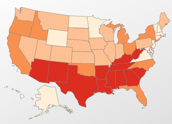
First off, poverty rates are a lot higher in the South.
 Source: USDA
In fact,
as many as one in four Southern kids lives in poverty, compared to the national average of
one in five.
In
the map above, red shading indicates a poverty rates between 17.9 and
22.8 percent. Orange indicates 15.9 to 17.8 percent; light orange,
12.2-15.8 percent; pale yellow, 9 to 12.1 percent. As you can see,
there's a lot of high-poverty red in the South.
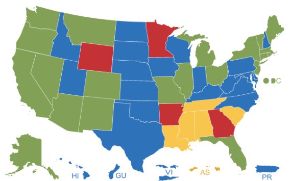
And minimum wages are much lower.
 Source: Department Of Labor
Virtually
no Southern states, with the exception of Florida, have a minimum wage
higher than the federal floor of $7.25 an hour. Many Southern states do
have relatively
low living costs.
But they are not dramatically lower than costs of living in other
states, such as Ohio and Missouri, that have set minimum wages at least
slightly higher than the national limit. The Southern states are doing
the absolute minimum for their poorest citizens by keeping the minimum
wage at the lowest levels possible.
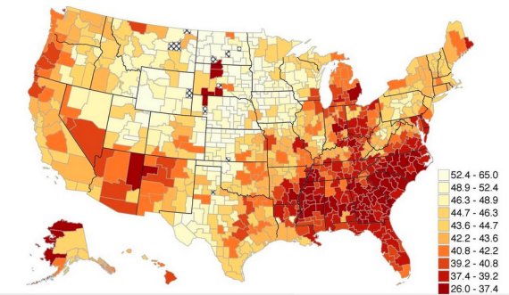
And people living in the South are a lot less likely to move up the economic ladder.
 Source: Equality Of Opportunity Project
If
you want to achieve the American Dream, don't move to the South. That's
because states in the South have extremely low levels of economic
mobility. In the map above, pale yellow represents places with higher
mobility, while red indicates low mobility.
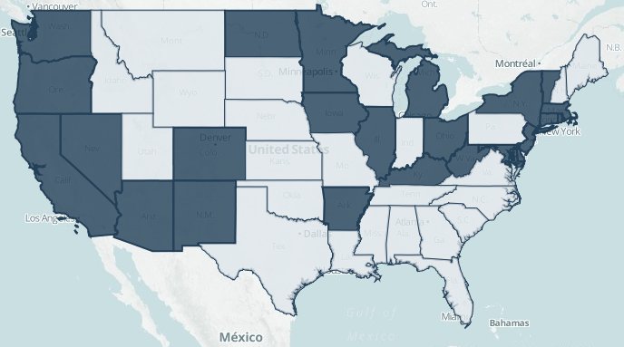
Many living in poverty in the South are being denied access to affordable health care.
 Source: Urban Institute
States that
didn't choose to expand Medicaid under Obamacare are highlighted in lighter gray.
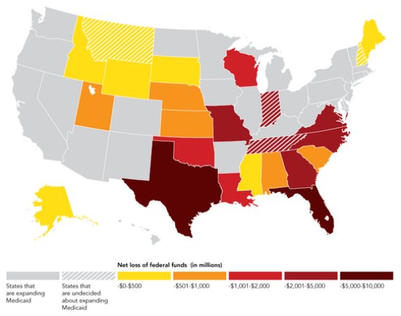
...which is costing these states a ton of money.
 Source: The Huffington Post
This map shows how much money the
19 states that rejected Medicaid expansion will lose by 2022 as a result of doing so (assuming all other states participate).
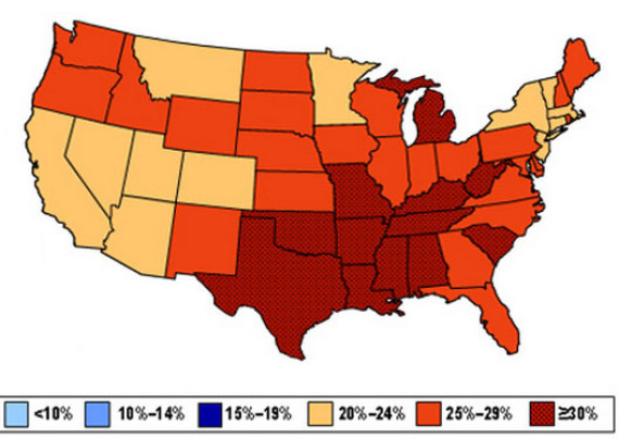
This is particularly troubling because the South has several health crises on its hands. Like obesity.
 Source: CDC
Obesity rates are too high across the U.S. But they're particularly high in the South.
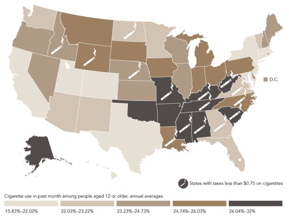
Southern states also have a higher percentage of cigarette smokers.
 Source: The Huffington Post
Most
Southern states have a higher percentage of smokers than anywhere else
in the country. Incidentally, most Southern states have relatively low
taxes on cigarettes.
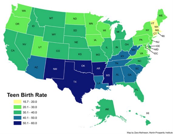
And a much higher rate of teen births.
 Source: Zara Matheson + Atlantic Cities
The
map plots birth rates among women ages 15 to 19. In states shaded dark
blue, there are more than 50 births per 1,000 teenage women.
Perhaps all this is why some Southern states are among the least happy states in the country.
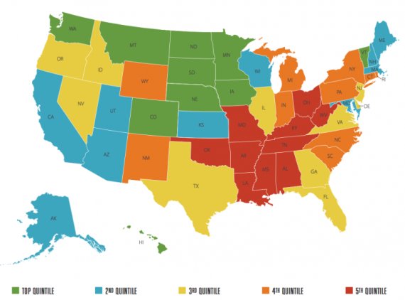 Source: Gallup
That's
according to Gallup's recent "State of American Well-Being" report,
which surveyed thousands of Americans and ranked states based on an
average of six measures: "life evaluation," emotional health, physical
health, healthy behaviors, work environment and basic access to things
like food, water and shelter.


No comments:
Post a Comment
Please leave a comment-- or suggestions, particularly of topics and places you'd like to see covered