Inspiring Better Cities.

Imagine We’re All Hailing Cheaper, Driverless Taxis by 2030
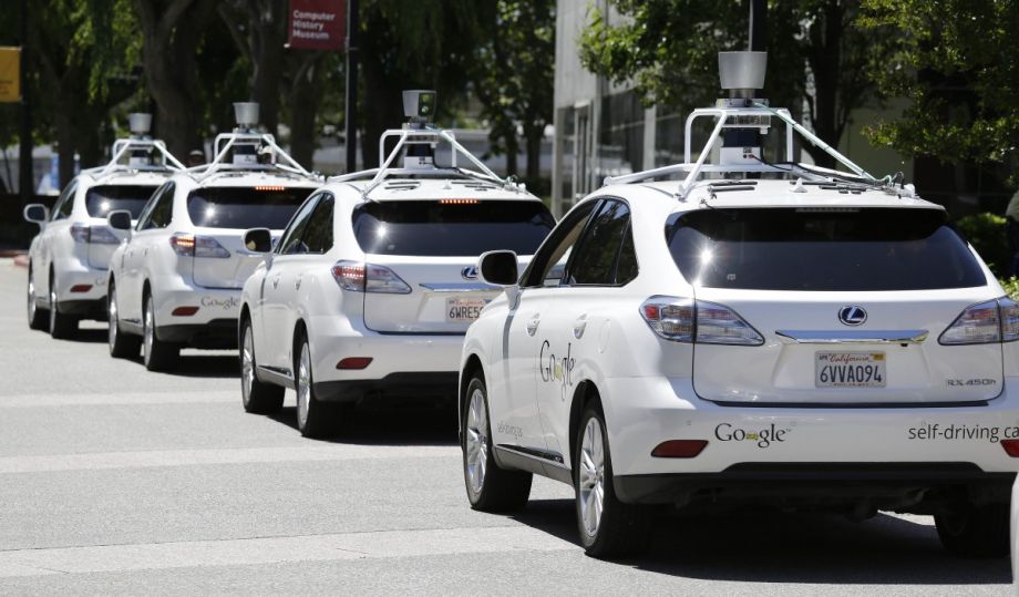
Google’s self-driving cars (AP Photo/Eric Risberg, File)
Right now, the battles of taxi driver vs. Uber driver, and Uber contractor vs. Uberemployee seem far from over. But what if, by 2030, there were significantly fewer drivers to hail?
That’s the future that scientists from the U.S. Department of Energy’s Berkeley Lab envisioned for a study published in Nature Climate Change this week. Jeffery Greenblatt and Samveg Saxena examined the possible environmental and economic benefits of on-demand driverless cars, if the transport mode was adequately adopted over the next 15 years.
From a Berkeley Lab news release:
The analysis found that the per-mile greenhouse gas emissions of an electric vehicle deployed as a self-driving, or autonomous, taxi in 2030 would be 63 to 82 percent lower than a projected 2030 hybrid vehicle driven as a privately owned car and 90 percent lower than a 2014 gasoline-powered private vehicle. Almost half of the savings is attributable to “right-sizing,” where the size of the taxi deployed is tailored to each trip’s occupancy needs.
In other words, if only one person needs a ride, a smaller vehicle would arrive to pick her up, instead of a big SUV or even a four-seat car.
“When we first started looking at autonomous vehicles, we found that, of all the variables we could consider, the use of autonomous vehicles as part of a shared transit system seemed to be the biggest lever that pointed to lower energy use per mile,” Greenblatt said.
For driverless cars to truly make it to the main stage, of course, there are a number of hurdles — including technology development, traffic laws and the murky variable ofhuman behavior — that could slow an autopilot boom.
The benefits of making the driverless transport electric, the scientists say, do depend on cleaner power: “By 2030 power plants are expected to be using more renewable energy and emitting less pollution, meaning the greenhouse gas intensity of electricity will be lower.”
Another plus highlighted in the study is the increased efficiency possible with driverless cars, which can operate continuously without a break. The cars would just roam our city streets waiting for us to call. This, the study argues, would cut down on pollution caused by traffic. And since there would be no human operator, the ride itself could be less expensive for passengers.
Though the study didn’t attempt to assess how widespread this technology would be by 2030, it did conclude that if 5 percent of 2030 vehicle sales were shifted to autonomous taxis, it would save around seven million barrels of oil a year. There are still a number of other questions left unanswered, and those are variables that might only be resolved once the technology is more widely tested: Would enough passengers trust a driverless car to put them in high demand? How would this affect traditional medallion cab drivers or Uber drivers?
Marielle Mondon is an editor and freelance journalist in Philadelphia. Her work has appeared inPhiladelphia City Paper, Wild Magazine, and PolicyMic. She previously reported on communities in Northern Manhattan while earning an M.S. in journalism from Columbia University.

What Magnum P.I. Can Teach Us About Visualizing Urban Resilience Data

SPONSORED CONTENT
Like many older millennials, I grew up building with Legos on the floor of the living room while Tom Selleck sped around on the TV in a bright red Ferrari 308 GTSsolving crimes of all types with a level of mustache-powered suave that remains unmatched to this day. Decades later—as an investigator of urban resiliency—I often find myself shamelessly channeling the wisdom of Thomas Magnum, P.I.
From flooding in Phnom Penh to a food shortage in Mozambique, our newsfeeds are continuously overflowing with incomplete fragments of urban narratives. Nearly instantaneous digital access to photojournalism and videography gives us real-time glimpses of “how it must feel” around the world—on the ground, in the moment, at the time.
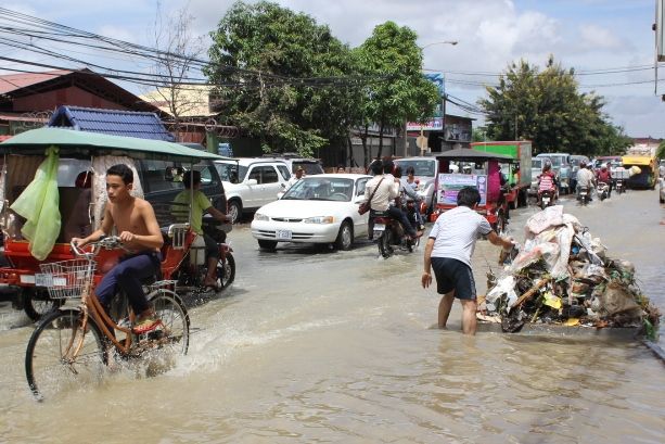
Flooding in Phnom Penh.
As an urban designer and resiliency analyst, I want to know more. What led up to this? Where did it come from? What could have been done proactively beforehand to lessen the negative impacts? All 1980’s mustache references aside, Magnum P.I. knew it just as well as I do: there is always a hot trail to be followed and you can’t catch up to anyone or anything of value without having the fastest car.
HOT PURSUITS: CHASING DOWN URBAN ISSUES
The urban situations we study often behave a bit like fugitives. They tend to show us false identities on the surface, and we have to go backstage with them for a while to truly understand them. In getting to know a city, we can only go so far with singular data. A value such as overall economic growth means very little until we overlay it onto other conditions like educational accessibility or public health indicators. As we approach cities with this type of systems thinking, we see that binary yes-or-no questions and answers have almost entirely lost their relevance.
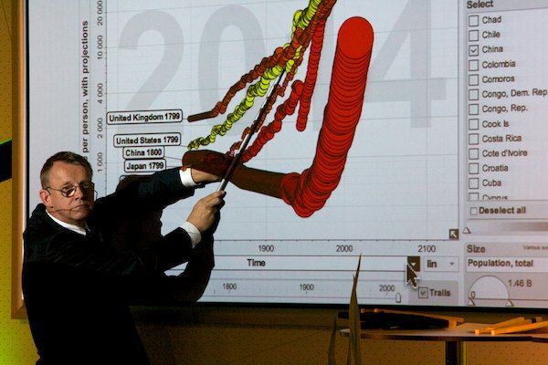
Swedish doctor and international health visionary Hans Rosling visualizing health data.
As our modes of questioning grow in complexity, the standard out-of-the-box MS Office visualizations are falling to the wayside. Even as flashy as Microsoft has tried to make them in recent years, the multi-colored bar graphs of yore simply cannot keep pace with the intensity of urban analytics in the network age. Like distant galaxies without the Hubble Space Telescope, the fleeting relationships at play in a city are simply not visible without powerful analytics and multi-layered data visualization tools.
UNDER THE HOOD WITH PROCESSING TECHNIQUES
For a number of years, digital artists and designers have been experimenting with processing techniques to transform these elusive data patterns into crystal clear visual communications—nuances and all. Their crime-fighting vehicle of choice? A fleet of liquid-cooled multi-core processors glowing with blue LED’s and humming away at multi-thread calculations somewhere in a distant data center.

A visualization of flight patterns by Aaron Koblin. Image courtesy of Aaron Koblin.
Aaron Koblin has focused his work in this realm of network data visualization. Manipulating datasets with millions of entries of various content types, he is finding fruitful ways to build bottom-up visualizations that can help us understand human and infrastructural networks in poetic and almost indescribable ways.
Through a comprehensive multi-scale animation, he shows us the real-time paths of nearly every flight in the world for 24 hours. The critical takeaway is not the binary fact that the FAA is monitoring 140 and some-odd thousand aircraft at any given time, but how the individual flight paths dance rhythmically in time around the world. We see blue paths diverging and converging around the world, perfectly matched with the daily human pulses of waking, sleeping, moving, and connecting. Zooming in to individual airports, Koblin shows us highly-specific holding patterns and adaptations in flight paths as air traffic densities and wind directions shift throughout the day.
GOOD DATA GENERATED THROUGH RECREATION
Similar data sets are showing up in the fitness apps world.

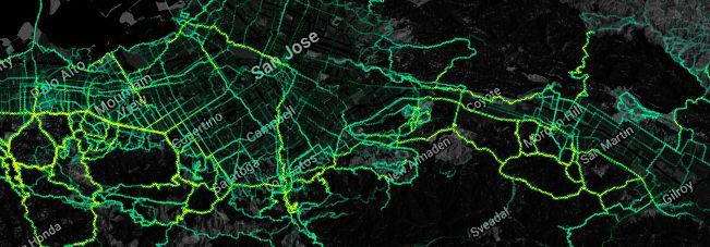
Heatmaps, Strava Labs
Platforms like Strava allow running and cycling enthusiasts to map, record and share their routes through GPSrecording.
The overlay of these pathways in a city help us to assess its fitness (and vis-a-vis, its overall health) landscape. These highly-accurate heat maps show us both hot and cold physical exercise areas of the city over time. As urban designers, we can begin to take cues on specific locations which could benefit from fitness-related development to help bridge geographic gaps in the fitness network and bolster the overall health and well-being of the city.
Heatmap, courtesy of Richard Masoner / Cycleicious via Flickr CC
SYNTHESIS WITH ANIMATED INFORMATION
In other aspects of health, there are big issues that we can begin to attack more rigorously through data visualization. We’ve known for decades that Africa struggles with AIDS, but it is not enough to simply quantify the number of infected individuals. In urban resilience, we need to understand it in greater contextual nuance. We need to see the dynamics of the problem over time and in juxtaposition to other contributing and resultant factors like poverty, social/cultural views, public health education, etc.
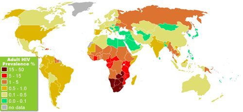
Map courtesy of Blatant World / Flickr CC
Hans Rosling is adopting animated blobs for contextualizing these urban health issues with a dynamism and clarity that we just can’t see through pages and pages of traditional stationary line graphs.
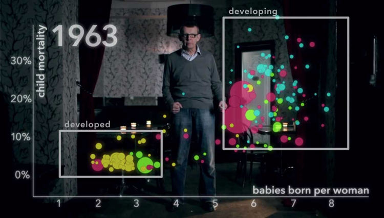
The River of Myths, Hans Rosling
His animated graphic nodes grow, shrink, and float freely through x and y coordinates, reflecting specific shifts in global health patterns throughout decades of changing cultural, political, infrastructural, and financial conditions. Through animation, Rosling’s blobs show us not just notable trends, but dynamic rates of change. He’s effectively using a calculus framework of visualization while everyone else is stuck in the static land of algebra.
RESILIENT SOLUTIONS 21
In our own work at Resilient Solutions 21, we’re developing similar traction by merging data sets which have historically been represented as their own autonomous figures. Traditionally, climatic indicators have been pigeon-holed into bar or line graphs with a separate graph for each layer of information—one for average high temperature, one for average low, one for humidity, and so on. Moving beyond this singular methodology, we are developing parametric tools which allow us to understand dynamic relationships between weather patterns and the ways cities actually operate every day.
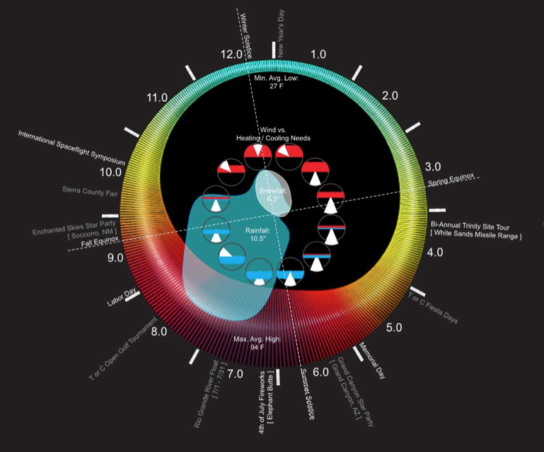
Anthropo-Climatic Diagram, Resilient Solutions 21
In the example above, we are displaying a wide range of factors which are all related to one another, but are rarely visualized in this way—together as a system. Temperature, precipitation, snowfall, length of day, wind patterns, and expected demand for heating/cooling systems are all displayed simultaneously. This layered format helps to quickly highlight primary correlations among data sets.
Then, by adding significant civic events to the weather calendar, we can start to look at additional relationships of how weather and culture are interacting and influencing one another within the city. Like a fingerprint, the anthropo-climatic signature of every place is unique.
These types of dynamic visualizations help us more clearly see the real idiosyncrasies that define a city and its true resilience characteristics.
LOOKING DOWN THE ROAD
It’s now been 27 years since Magnum P.I. turned in his badge, and the world is a vastly different place. In our systems approach to urban resilience, data visualization is more than a passive mechanism for communicating one-line statistics and simple geographies. As our tools develop increasingly robust capabilities, they are becoming active participants in analyzing, dissecting, and nimbly responding to otherwise inaccessible urban relationships. As a discipline, we are just getting started and there will be great wealth of innovation in the space in years to come. The bright red visualization Ferrari is in the garage, getting highly tricked out. Soon, it will be chasing down even the fastest of urban problems.
Brian is a resilience analyst and urban designer with nearly ten years of experience working on problems of architecture and resilience in Haiti, Korea, and across the U.S. He thrives on collaborative opportunities to engage complex urban situations with in-depth and synthetic research techniques.Resilient Solutions 21, or RS21, pulls from a wide array of disciplines to create solutions for cities, countries, agencies and businesses challenged by the physical, social and economic forces that will drive our world in the 21st century. For more information, contact charles@resilientsolutions21.com.

How Much Do New Markets Tax Credits Help Low-Income Communities?
A new study finds that commuters, not nearby residents, are the primary beneficiaries from business investment owed to New Markets Tax Credits. (AP Photo/Steven Senne)
For urban neighborhoods with a large population of low-income residents, the existential challenge often becomes how to attract private investment that can stabilize and improve the community without pushing out the people who are already there. There are few tools cities can use to address this challenge but among them is a heavy-hitter: the U.S. Treasury’s New Markets Tax Credit program.
Established in 2000 by Congress to spur investment in low-income communities, the $43.5 billion program gives tax credits to businesses that create jobs in these marginalized areas. But while the program has gained bipartisan support and many friends in the urban development world, new research from Drexel University economist Matthew Freedman argues that perhaps the program isn’t quite as effective as those focused on equitable development would hope.
In his new paper, “Place-based programs and the geographic dispersion of employment,” Freedman points out that the NMTC program may not be creating the impact it aims to, because of a loophole that allows subsidized businesses to hire workers from outside of the low-income area the tax credits are intended to support.
Freedman’s data analysis indicated that people outside of low-income target neighborhoods are actually the primary beneficiaries of new jobs created in the areas receiving credits.
“What’s not surprising is that money goes into these projects with the hope that it’s going to help local residents,” says Freedman. These commercial investments are intended to provide jobs, in addition to services, amenities and other resources. “But what I find in this paper using administrative data not only on where people live, but where they work, identifies the fact that the money going into these communities does increase employment by a little bit, but it does not increase the number of residents in these communities who have jobs by any discernible amount.”
New hires, he finds, end up commuting in from relatively affluent neighborhoods.
Gentrification, unsurprisingly, plays another key role in whether or not the NMTCprogram benefits the residents of low-income communities.
“You tend to get more bang for your buck out of these programs in neighborhoods that are stable or declining than in those that are gentrifying,” says Freedman, “for the simple reason that the neighborhoods that are gentrifying are likely to be getting this investment even in the absence of the program. The money that we’re pouring into [gentrifying] neighborhoods ends up being a pure transfer from taxpayers to developers or businesses that are lucky enough to be getting these subsidies.”
He points out that the formula for determining which census tracts are eligible for the program (80 percent of statewide median family income) doesn’t weed out neighborhoods that might only look poor on paper — areas around college campuses, for example — where these investments aren’t going to have a major impact on alleviating unemployment and poverty.
There is evidence to suggest, however, that in stable or declining communities, these subsidies do make a difference in whether businesses or developments are feasible or at least feasibly competitive with affluent neighborhoods. He says regulations that tighten neighborhood eligibility and require businesses to hire locally could help the program fulfill its original mandate to create more economic opportunity in low-income areas.
“This points to potential areas where the design of the program might be improved,” says Freedman. “They won’t be able to change the eligibility requirements at whim, but I will say that there are certainly ways this program could be better targeted both to ensure that money is not going to projects that would have happened even in the absence of any subsidies, but also to ensure that the money is flowing into communities where it is needed.”
The Equity Factor is made possible with the support of the Surdna Foundation.

Alexis Stephens is Next City’s equitable economic development fellow. She’s written about housing, pop culture, global music subcultures, and more for publications likeShelterforce, Rolling Stone, SPIN, and MTV Iggy. She has a B.A. in urban studies from Barnard College and an M.S. in historic preservation from the University of Pennsylvania.
Chicago Design Student Revamps Homeless Signs

(Photo by Oriez)
Chicago design student Ian Todd is getting attention for his attempts to help people who are often invisible to many city-dwellers. The 23-year-old, who’s a student at the Chicago Portfolio School, which focuses on advertising and design, is redesigning the signs some homeless people use to ask for support. He says when he arrived in Chicago, he was surprised at the number of homeless and thought he could do something to improve their visibility on the busy streets.
“My hope was that the Chicago project would create some awareness around the homeless,” Todd told the Chicago Tribune. “And also that people would be more inclined to talk when they walk by, and more willing to give.”
Todd isn’t the first to give signs like this a makeover.Boston-area artists Kenji Nakayama and Christopher Hope started a similar project in 2011, which was around the same time that Christopher Devine was doing his own such revamp in Chicago.
While the new signs may be more eye-catching — which may increase the amount of money sign-holders get from passersby — homeless advocates say that the problem requires systemic action.
Homeless populations are on the rise in many cities across the country, including Chicago and Los Angeles. (In L.A.,Skid Row Housing Trust has taken a much broader design approach to helping the homeless by building aesthetically pleasing apartments, where residency comes with a range of support services.)
Ed Shurna, executive director of the Chicago Coalition for the Homeless, told the Tribunethat about 6,000 people fill the city’s shelters every night, and that the current homeless population is the largest in recent memory. According to the Tribune, Shurna thinks Governor Bruce Rauner’s budget priorities could be calamitous.
“If the cuts being proposed at the state level continue, you are going to see shelters closing,” Shurna told the paper. “There is going to be a big increase in homelessness, and even now the shelters aren’t sufficient.”
Jenn Stanley is a freelance journalist, essayist and independent producer living in Chicago. She has an M.S. from the Medill School of Journalism at Northwestern University.
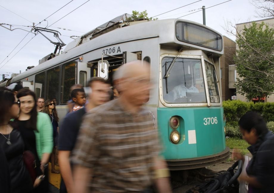
Lawsuits Stack Up in Employee vs. Contractor Battle of Summon-by-App Economy

A Postmates delivery (AP Photo/Candice Choi)
The lawyer behind lawsuits against Uber and Lyft over whether drivers should be considered employees or independent contractors is taking on similar companies.
Shannon Liss-Riordan, who’s based in Boston and hassuits pending against the ride-service-on-demand companies in the Northern District Court of California, recently filed similar complaints against startups Shyp, Washio and Postmates.
The Boston Business Journal reports:
Liss-Riordan’s clients … claim that these companies exercise the same control over their workers, particularly those involved in delivery, as [Uber].
The California Labor Commission ruled last month that San Francisco-based Uber driver Barbara Ann Berwick isan employee of the ride-service giant. Uber is appealing; classifying drivers as independent contractors is central to its (booming) business model.
“The companies are setting rules and guidelines and threatening termination when the workers don’t follow those rules,” Liss-Riordan told the Journal. “It’s an inherent tension: They want to control their workers so they can provide a level of service that will grow their business, but they want to avoid labor costs and shift the expenses of running a business to their workers. They can’t do both.”
The Journal also reports that Shyp just publicly announced plans to count its couriers as employees, and that “the shift wasn’t made in response to the lawsuits against on-demand app companies.”
Jenn Stanley is a freelance journalist, essayist and independent producer living in Chicago. She has an M.S. from the Medill School of Journalism at Northwestern University.
S.F. Officials Consider Obamacare Costs for Most Vulnerable
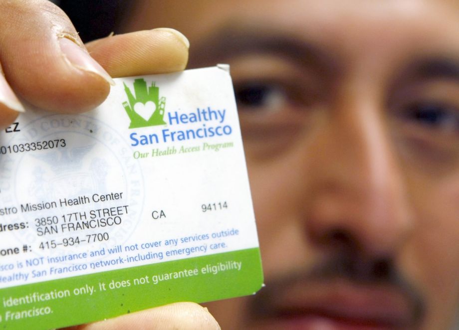
A 2009 visitor to the Castro-Mission Health Center shows a Healthy San Francisco card. (AP Photo/Marcio Jose Sanchez)
San Francisco County is struggling to provide health care to low-income residents who qualify for health insurance under the Affordable Care Act. Before the rollout of President Barack Obama’s health care reforms, low-income residents qualified for Healthy San Francisco, a nearly free program that has served about 60,000 patients each year since it started in 2007.
According to the Los Angeles Times:
Before the rollout of the Affordable Care Act last year, many of the clinic’s patients had no medical insurance and their visits were partly covered by the county’s program. With more than 70% of its patients lacking traditional health insurance, [a downtown clinic] almost went broke in 2011 because it wasn’t generating enough revenue, [the clinic’s director Elizabeth] Sekera said.
But Obamacare’s massive health insurance expansion has been a boon to this and other community clinics across the state, with insurance plans paying for treatments that used to be provided free of charge or at very low cost to patients. Now 70% of the clinic’s patients have insurance.
But it hasn’t felt like a financial blessing for all her patients. Many tell Sekera they can’t afford the additional costs that have come with Obamacare coverage while managing the high cost of living in San Francisco.
According to the newspaper’s report, many people enrolled in Healthy San Francisco are undocumented, and as such are ineligible for Obamacare plans. Others simply can’t afford some of the high premiums and copays associated with many Obamacare plans. San Francisco County has already allowed 1,800 people eligible for Obamacare to keep Healthy San Francisco plans, and officials are considering other options to help patients get more affordable rates on these plans. The S.F. Board of Supervisors will likely decide later this summer whether or not low-income residents eligible for Obamacare can stay on Healthy San Francisco.
Jenn Stanley is a freelance journalist, essayist and independent producer living in Chicago. She has an M.S. from the Medill School of Journalism at Northwestern University.
No comments:
Post a Comment
Please leave a comment-- or suggestions, particularly of topics and places you'd like to see covered