Watch the World Switch from Internet Explorer to Chrome
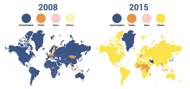
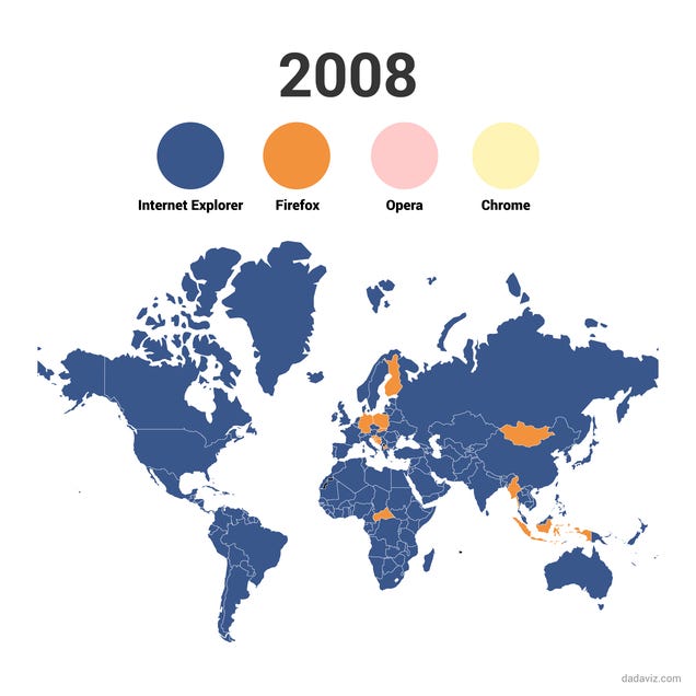
Somewhere deep in the cobweb-filled recesses of your brain, you might remember a time when checking your email meant booting up Internet Explorer. But as this infographic shows, it wasn’t long ago that the world was filled with Internet Explorers. Then, a couple years back, nearly every country switched to Chrome.
The visualization below, which colors countries based on the most popular desktop and tablet internet browser of the year, was created by Jody Sieradzki using data from the web tracker Stat Counter. The widespread switch from Internet Explorer to Chrome is fascinating to watch, but so are some of the other regional patterns: Opera, for instance, had a brief moment of glory in Russia and former USSR countries six years back, while Firefox swept across Asia and Africa in 2011 and 2012 before getting dethroned by Chrome. In 2014, the two people living in Greenland decided to give Safari a go.
It was a short-lived experiment.
[Dadaviz]
Contact the author at maddie.stone@gizmodo.com or follow her on Twitter.


No comments:
Post a Comment
Please leave a comment-- or suggestions, particularly of topics and places you'd like to see covered