Translation from English

Wednesday, February 25, 2015

Gizmodo: 7 Slo-Mo GIFS That Show of Android Lollipop's Delightful Animations

7 Slow-Mo GIFs That Show Off Android Lollipop's Delightful Animations

7 Slow-Mo GIFs That Show Off Android Lollipop's Delightful Animations
Android Lollipop is beautiful. It's the best Android has ever looked, thanks in part to its lovely animations and new "material design." We've taken a GIF-centric look at Lollipop before, but YouTuber The Nerd Herd took an awesome slow-mo look at the new animations, and I think that calls for a few more GIFs.
Here's The Nerd Herd's video but WARNING: It has very bad music:
So here are 7 bite-sized (and silent) GIF highlights:
7 Slow-Mo GIFs That Show Off Android Lollipop's Delightful Animations
And as Redditor Notty_Prince points out, you can turn this on in Developer settings if you're lucky enough to have Lollipop on your phone already, so go check out the slow-mo glory in person if you're so inclined! [h/t Reddit]
4 70Reply
The following replies are approved. To see additional replies that are pending approval, click Show Pending. Warning: These may contain graphic material.
Agreed. It ALL looks wonderful at first, but even on my iPhone 6, I can *still* feel exactly where the phone stalls me if it takes 1/2 a second too long for something that logically should happen the instant I touch the screen (the simple act of pressing the home button and watching the home screen 'slide' back... just go to it! — don't slide for one long second).
Basically, we're being taught to expect lightning speeds, so animations on phones are perhaps not the best place for them.
You can usually turn those off in developer settings in Android, and it speeds things up quite a bit since it's not loading the annoying "flare".
Edit: That's what I do on my device, even in Nova Launcher since I'm not a simpleton who needs fanfare everytime I do something on my phone. I hate when you reinstall a samsung rom and they have touch sound on by default. I know I'm touching my phone and if it's responding to my touch then you the device know it too. 
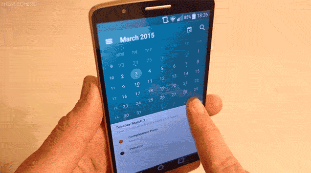
Ah but the effect they have on UX (when done right) is incredible. The transition can be used to imply spatial relationships that make using an app more intuitive. Take Google Inbox for example:
You are presented with a list of Emails, each is a screen-wide gray bar holding an icon, title, and snippet of text (sometimes a context aware info card too). Tap it, and it expands upwards and down to fill the screen - the impression is that you haven't gone anywhere, the list was just adjusted to show you the entire message. And sure enough, scroll down past the end of the text and there is the list again.
This performs the same function as the Gmail app in this regard, but instead of the transition animation the screen just blinks white and shows a loading spinner - the jump makes it feel like your message is a separate entity from the row on the list before, while the Inbox version makes it feel like it's all one continuous experience. In a case like this it also covers up part of the necessary load time to retrieve the message content - though this isn't always the case.
Yes it might waste a little time, and for a power user Android dev tools allows this to be disabled. But for most users it makes things flow in a much more intuitive manner. This is one of the biggest complaints about how Windows 8 handled it's apps, it had animations, but they were poorly designed and UX feel more disjointed by kicking you around between apps in no logical manner. Getting rid of them wouldn't really have helped, but I strongly believe MS could have had a much better reception if their transitions created a logical spatial connection between apps (zoom in an out on the Start screen grid, pan around in a logical direction to switch apps). What if it felt like the Start screen was a wall, and each app was a window looking into some app. Moving the point of view to those various windows via creative transitions could have made the whole thing much more usable.

No comments:

Post a Comment

Please leave a comment-- or suggestions, particularly of topics and places you'd like to see covered