11 maps that explain the US energy system
Ever wonder what America's energy infrastructure looks like? All
those power plants and coal mines and oil wells and transmission lines?
Then you're in luck. The Energy Information Administration (EIA) has a fascinating new mapping tool that lets you take a detailed look at every aspect of America's energy system.
Below I've pulled out 11 maps of interest, but you can use the tool
to customize the maps in any way you want (or zoom in to see state-level
details and look at individual congressional districts).
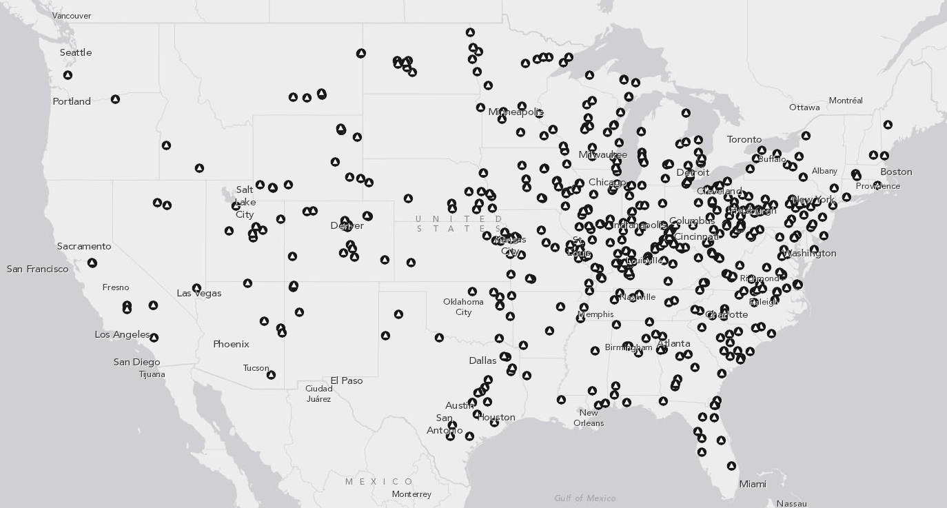
In 2012, there were 557 coal plants in the United States, generating about 37 percent of the nation's electricity — the biggest single source of power.
But coal has also fallen out of favor in recent years. For one, a glut of cheap natural gas from fracking operations has steadily eroded coal's share and forced power-plant operators to close many of their older, less efficient plants. Between 2010 and 2012, electric utilities retired 145 generators, with an average age of 55 years old.
There's also pollution and climate change to consider. Coal emits plenty pollutants when burned — including the greenhouse gases responsible for global warming. Various new regulations from the Environmental Protection Agency on mercury, sulfur-dioxide, and carbon-dioxide are likely to put further pressure on coal plants to retire in the years ahead. (Though even with those rules, the EPA expects coal to provide 30 percent of the nation's electricity in 2030.)
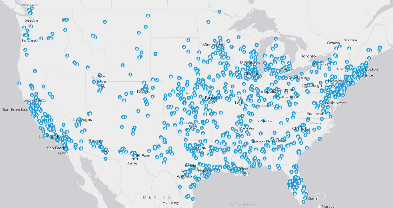
Natural gas plants tend to be smaller, easier to build, and emit fewer conventional pollutants than coal plants — so they're more widespread. In 2012, there were 1,714 natural gas plants providing about 30 percent of the nation's power.
Natural gas is still a fossil fuel, though it tends to be cleaner than coal when burned for electricity — emitting fewer conventional pollutants like sulfur-dioxide and about half as much planet-warming carbon-dioxide. In the past, one major downside of natural gas was that prices could fluctuate wildly. But with the recent fracking boom, many analysts are predicting that cheaper natural gas will be plentiful for decades — and hence play a bigger role in the electricity sector.
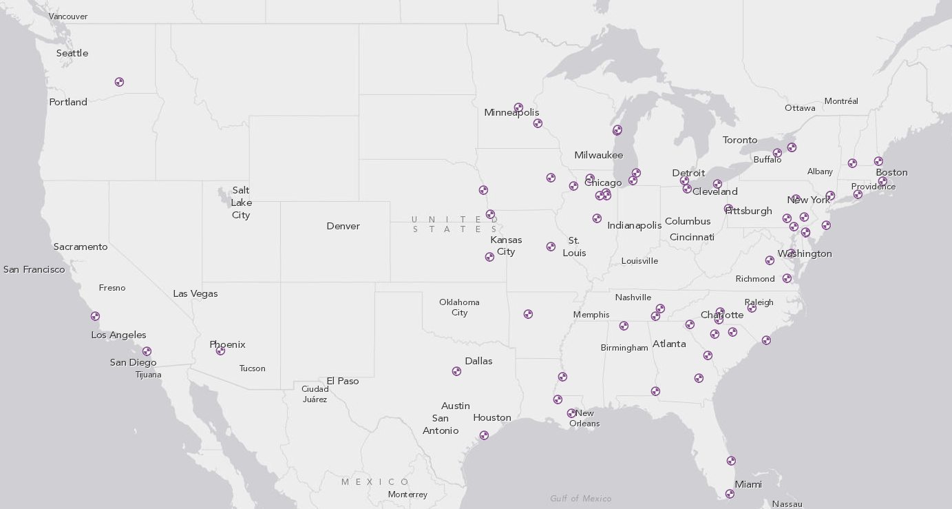
There are currently 62 nuclear power plants in operation containing 100 reactors. Those reactors provide 19 percent of the nation's electricity — without emitting any heat-trapping greenhouse gases.
In recent years, however, a few reactors have started closing, under pressure from cheap natural gas and wind power, plus rising maintenance costs. At the same time, many power plant operators have managed to squeeze more power out of their existing reactors (a practice known as "uprating"), which has helped nuclear power maintain its share.
Relatively few people are building new reactors these days — there are just five in the works at existing sites in Tennessee, Georgia, and South Carolina. In general, the high cost of nuclear plants is a deterrent (these five reactors are all being built in highly regulated states where utilities can recoup their costs by raising rates). The key question is how quickly existing plants might retire in the years ahead. The EPA's recent climate rules give states some incentives to keep their nuclear reactors open for longer.
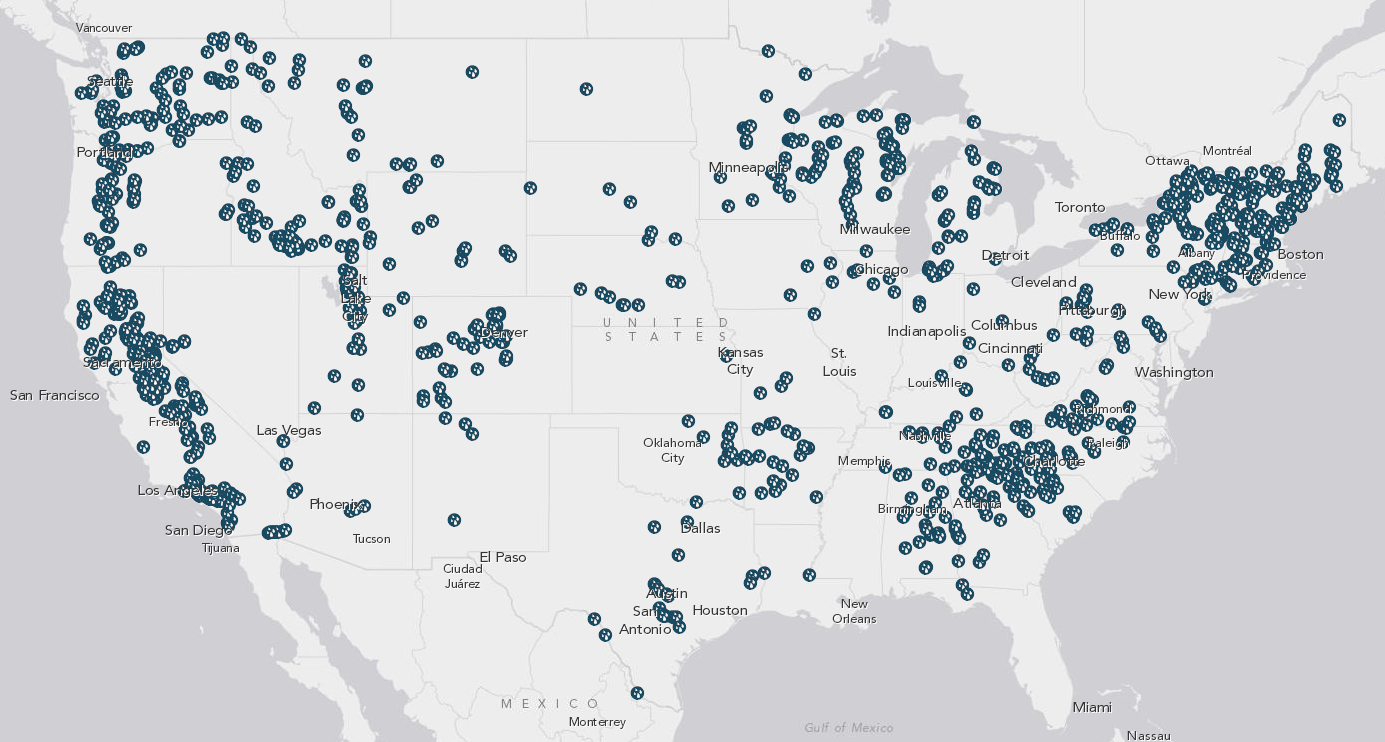
Hydropower is, by far, the biggest source of renewable power in the United States. In 2012, there were 1,426 hydroelectric dams providing 7 percent of the nation's electricity.
But not all dams are equal. The massive dams in the West provide a disproportionate amount of electricity — Washington, home of the Grand Coulee Dam, produces nearly one-third of the nation's hydropower. But there are small dams around the country providing more modest jolts of power.
It's unlikely that the United States will ever build any more massive dams — most of the best sites are already tapped, and dams can be controversial. (No one's going to dam up the Grand Canyon, for instance.) Still, one recent analysis suggested that the country could eke out even more hydropower by adding generators to existing dams that don't already have them.
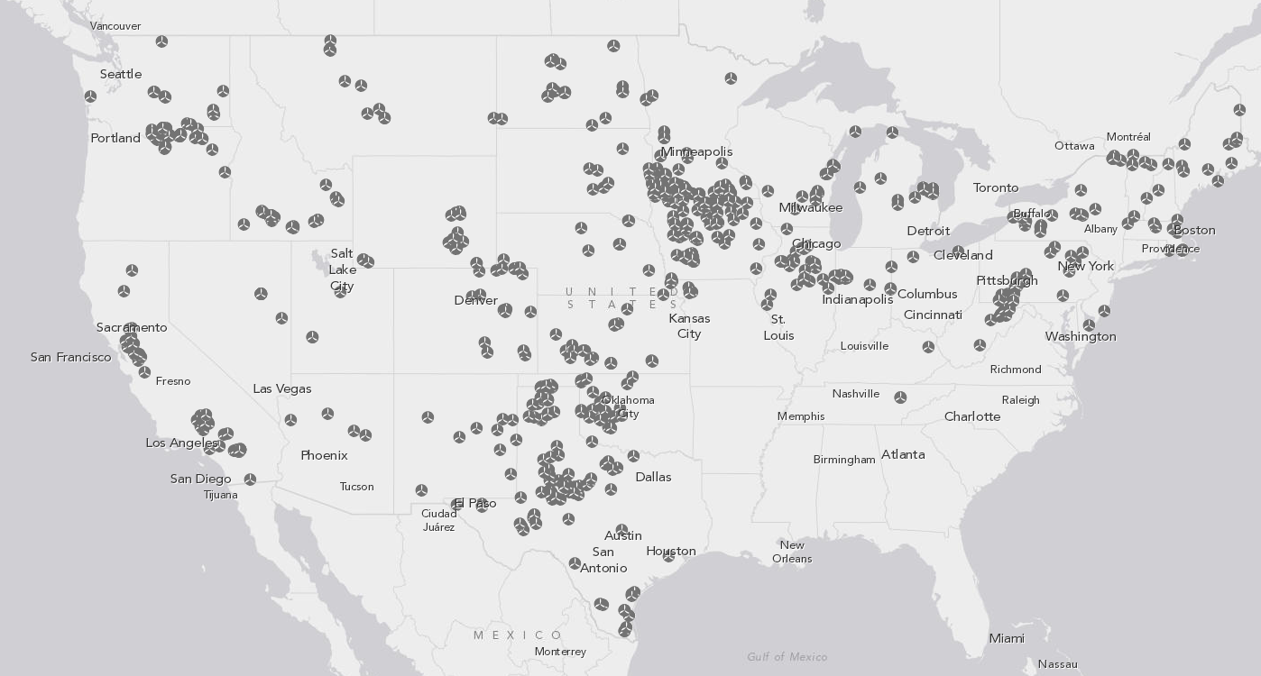
Wind has been rising fast, albeit from a low base. In 2008, wind provided about 1 percent of the nation's electricity. That rose to 3.6 percent in 2012 and 4.1 percent in 2013.
There are two big reasons for that rapid growth: The federal government has provided both tax credits and subsidies (with a big boost in the 2009 stimulus bill). What's more, many states now have laws requiring utilities to get a certain portion of their electricity from renewables. (One notable exception here is the Southeast.)
The federal government may be withdrawing some of that support — it's not clear whether Congress will renew a key tax credit for wind power in the years ahead. Still, the costs of wind have fallen sharply in recent years, and some analysts expect it will continue growing regardless (albeit more slowly) in places like the Midwest and the Great Plains.
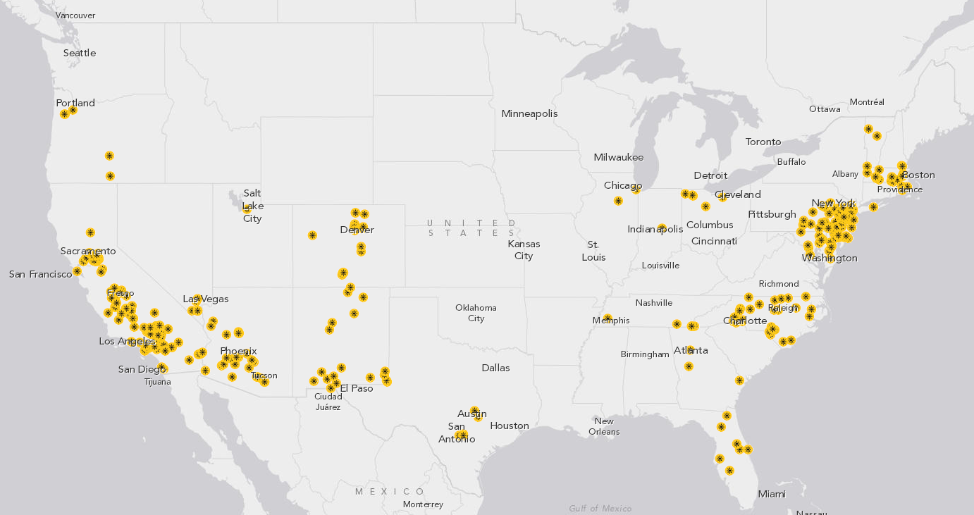
Solar power still plays a bit part in the US energy system — providing around 0.11 percent of electricity in 2012.
The flip side, though, is that solar-panel prices have been plummeting fast. Indeed, some utilities have worried that as more and more people install photovoltaic systems on their roofs, that could cut into energy sales. David Crane, CEO of NRG Energy, has called these trends "a mortal threat to the existing utility system."
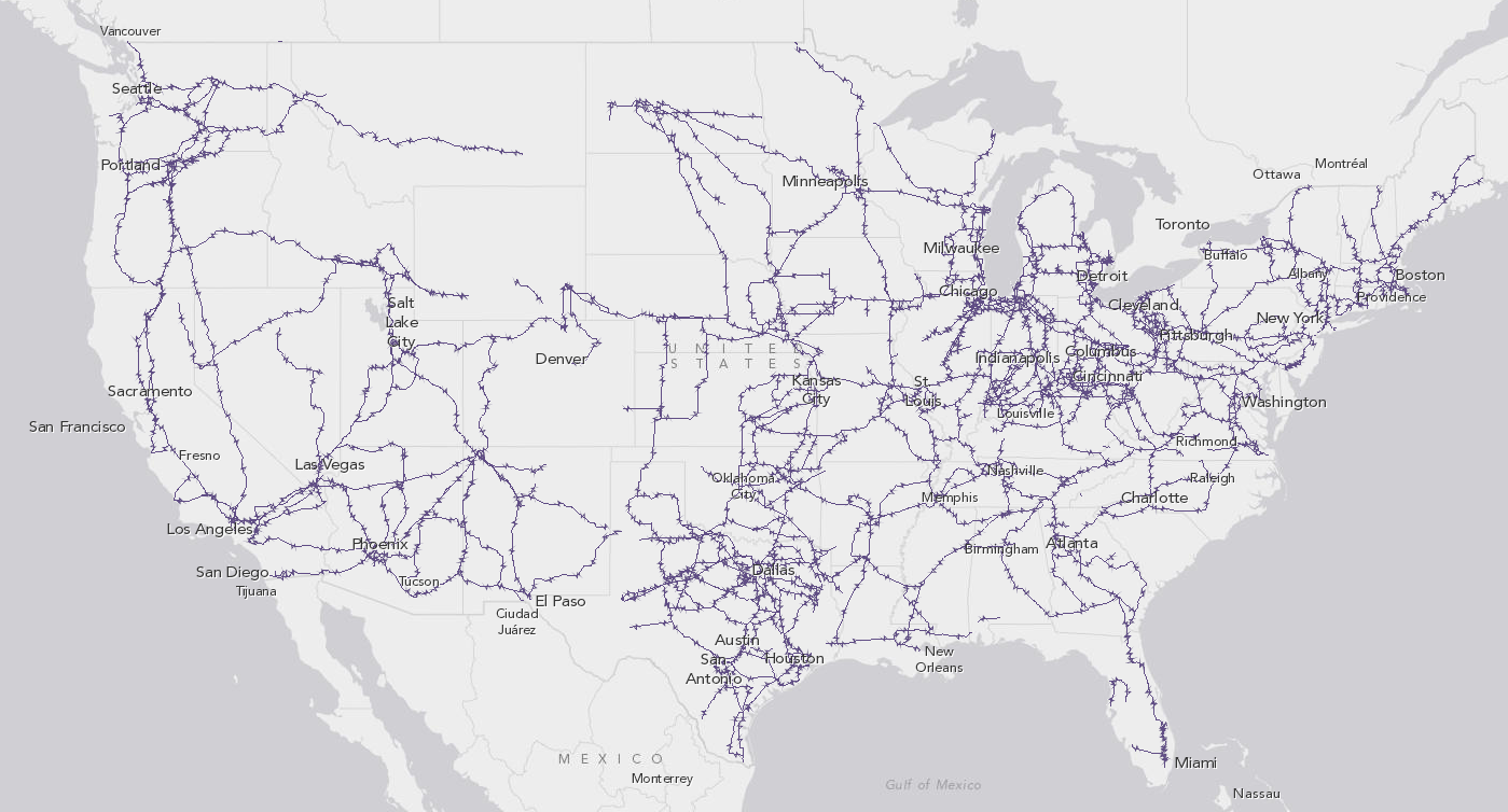
The regulation of the US power grid is insanely complicated — and it tends to be really tough to build big new transmission lines (say, if you want to transport electricity from a giant new wind farm out in the Great Plains to population centers).
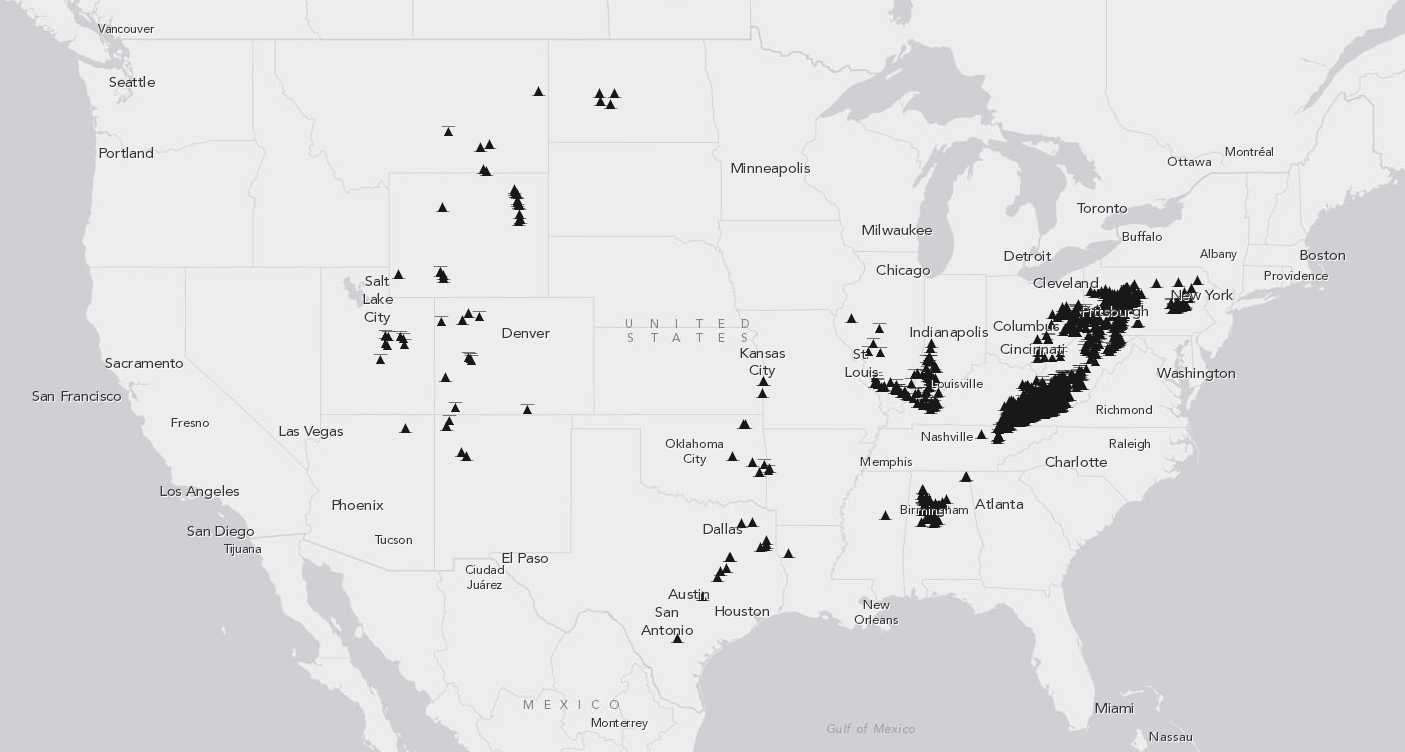
Judging by this map alone, you'd get the impression that Appalachia is the center of coal country. But in fact, that's no longer true.
Ever since the late 1990s, more of America's coal has come from west of the Mississippi — particularly from Wyoming — than from the East. And that trend is likely to continue for some time.
There are a few reasons for that. The coal out West tends to be lower in sulfur, which is useful for US coal plants that are trying to cut their sulfur-dioxide emissions in response to pollution regulations. What's more, states like Kentucky and West Virginia have already mined much of their easiest-to-reach coal seams — and many areas are now in decline.
Coal production is expected to take a hit in the future if the EPA's new climate rules lead to a decrease in coal-fired electricity. Some of the coal from Wyoming and elsewhere may start to get exported abroad, although that's a bit harder to predict.
It's worth noting that US oil production is actually growing — and fast.
By November 2013, the United States was producing 7.8 million barrels of crude oil each day, the most in a quarter-century. Oil production is now expected to keep growing until it reaches a peak of 9.6 million barrels per day in 2019.
Why the uptick? New fracking and horizontal drilling techniques have allowed oil companies to extract more oil from shale rock and other difficult formations. Advances in offshore drilling have also played a role.
That also means US oil imports are slowly shrinking. In 2012, the US relied on foreign countries for about 40 percent of the oil it uses. That's expected to keep shrinking in the decades ahead, as both domestic production increases and consumption drops (the US economy is becoming more oil-efficient and the growth in driving has slowed).
This map can also help shed light on a number of contemporary energy disputes.
For instance, a lot of oil is being dug up from the tar sands in Alberta, Canada. But there aren't enough pipelines (or railways) to bring that oil to refineries. That's why oil companies (and Canada) want to build the Keystone XL pipeline — to bring that tar sands oil down to refineries in Texas.
Oil companies have also argued that there's not enough refining capacity down in Texas to handle the recent boom in oil production in North Dakota and elsewhere. They'd like to lift the longstanding ban on exporting crude oil from the United States — in order to boost the price.
The rise of new fracking and horizontal drilling technologies has made many of these resources newly accessible. There are currently more than 63,000 shale oil wells and shale gas wells around the country. Much of the activity is concentrated in Texas, North Dakota, Louisiana, and the Marcellus Shale region in the East.
The shale boom has reshaped the American energy landscape. Domestic production of oil and natural gas has risen sharply, leading to cheaper energy and a reduced reliance on imports.
Advocates often argue that fracking is creating jobs, boosting manufacturing, and helping to tackle global warming by reducing the amount of coal we use. Opponents often argue that the industry is poorly regulated, the global warming benefits are overhyped, and that fracking has led to increased air and water pollution around the country.
(You can read about the shale boom — and its consequences — in much, much more detail in our fracking card stack.)
Update: Added "contiguous" to some of the captions here, since that's obviously what the maps show.
Then you're in luck. The Energy Information Administration (EIA) has a fascinating new mapping tool that lets you take a detailed look at every aspect of America's energy system.
1) Coal still provides 37% of the country's electricity:
This map shows every coal plant in the contiguous United States:
In 2012, there were 557 coal plants in the United States, generating about 37 percent of the nation's electricity — the biggest single source of power.
Coal has also fallen out of favor in recent years
But coal has also fallen out of favor in recent years. For one, a glut of cheap natural gas from fracking operations has steadily eroded coal's share and forced power-plant operators to close many of their older, less efficient plants. Between 2010 and 2012, electric utilities retired 145 generators, with an average age of 55 years old.
There's also pollution and climate change to consider. Coal emits plenty pollutants when burned — including the greenhouse gases responsible for global warming. Various new regulations from the Environmental Protection Agency on mercury, sulfur-dioxide, and carbon-dioxide are likely to put further pressure on coal plants to retire in the years ahead. (Though even with those rules, the EPA expects coal to provide 30 percent of the nation's electricity in 2030.)
2) Natural gas has been surging — and now provides 30% of our electricity
This second map shows all the large natural-gas power plants in the contiguous United States:
Natural gas plants tend to be smaller, easier to build, and emit fewer conventional pollutants than coal plants — so they're more widespread. In 2012, there were 1,714 natural gas plants providing about 30 percent of the nation's power.
Natural gas is still a fossil fuel, though it tends to be cleaner than coal when burned for electricity — emitting fewer conventional pollutants like sulfur-dioxide and about half as much planet-warming carbon-dioxide. In the past, one major downside of natural gas was that prices could fluctuate wildly. But with the recent fracking boom, many analysts are predicting that cheaper natural gas will be plentiful for decades — and hence play a bigger role in the electricity sector.
3) Nuclear power has flatlined, but still provides 19% of our electricity
Here are all the nuclear power plants in the United States:
There are currently 62 nuclear power plants in operation containing 100 reactors. Those reactors provide 19 percent of the nation's electricity — without emitting any heat-trapping greenhouse gases.
just five new nuclear reactors are being built
In recent years, however, a few reactors have started closing, under pressure from cheap natural gas and wind power, plus rising maintenance costs. At the same time, many power plant operators have managed to squeeze more power out of their existing reactors (a practice known as "uprating"), which has helped nuclear power maintain its share.
Relatively few people are building new reactors these days — there are just five in the works at existing sites in Tennessee, Georgia, and South Carolina. In general, the high cost of nuclear plants is a deterrent (these five reactors are all being built in highly regulated states where utilities can recoup their costs by raising rates). The key question is how quickly existing plants might retire in the years ahead. The EPA's recent climate rules give states some incentives to keep their nuclear reactors open for longer.
4) Hydropower is the largest renewable source, providing 7% of our electricity
This map shows hydroelectric dams around the country:
Hydropower is, by far, the biggest source of renewable power in the United States. In 2012, there were 1,426 hydroelectric dams providing 7 percent of the nation's electricity.
But not all dams are equal. The massive dams in the West provide a disproportionate amount of electricity — Washington, home of the Grand Coulee Dam, produces nearly one-third of the nation's hydropower. But there are small dams around the country providing more modest jolts of power.
It's unlikely that the United States will ever build any more massive dams — most of the best sites are already tapped, and dams can be controversial. (No one's going to dam up the Grand Canyon, for instance.) Still, one recent analysis suggested that the country could eke out even more hydropower by adding generators to existing dams that don't already have them.
5) Wind power is surging in the Midwest and Great Plains
Here's a map of the major wind farms in the contiguous United States:
Wind has been rising fast, albeit from a low base. In 2008, wind provided about 1 percent of the nation's electricity. That rose to 3.6 percent in 2012 and 4.1 percent in 2013.
There are two big reasons for that rapid growth: The federal government has provided both tax credits and subsidies (with a big boost in the 2009 stimulus bill). What's more, many states now have laws requiring utilities to get a certain portion of their electricity from renewables. (One notable exception here is the Southeast.)
The federal government may be withdrawing some of that support — it's not clear whether Congress will renew a key tax credit for wind power in the years ahead. Still, the costs of wind have fallen sharply in recent years, and some analysts expect it will continue growing regardless (albeit more slowly) in places like the Midwest and the Great Plains.
6) Solar is also growing fast, though is still fairly tiny
The map below shows large solar power plants around the country (it doesn't, though, show every last rooftop solar panel system):
Solar power still plays a bit part in the US energy system — providing around 0.11 percent of electricity in 2012.
The flip side, though, is that solar-panel prices have been plummeting fast. Indeed, some utilities have worried that as more and more people install photovoltaic systems on their roofs, that could cut into energy sales. David Crane, CEO of NRG Energy, has called these trends "a mortal threat to the existing utility system."
7) All those power plants require a lot of transmission lines
Here's a map of all the major (345 kV or more) transmission lines in the contiguous United States:
The regulation of the US power grid is insanely complicated — and it tends to be really tough to build big new transmission lines (say, if you want to transport electricity from a giant new wind farm out in the Great Plains to population centers).
8) Coal mining is shifting from Appalachia to out West
Here's a map of all the major coal mines in the United States:
Judging by this map alone, you'd get the impression that Appalachia is the center of coal country. But in fact, that's no longer true.
Coal mining in Appalachia is in decline
Ever since the late 1990s, more of America's coal has come from west of the Mississippi — particularly from Wyoming — than from the East. And that trend is likely to continue for some time.
There are a few reasons for that. The coal out West tends to be lower in sulfur, which is useful for US coal plants that are trying to cut their sulfur-dioxide emissions in response to pollution regulations. What's more, states like Kentucky and West Virginia have already mined much of their easiest-to-reach coal seams — and many areas are now in decline.
Coal production is expected to take a hit in the future if the EPA's new climate rules lead to a decrease in coal-fired electricity. Some of the coal from Wyoming and elsewhere may start to get exported abroad, although that's a bit harder to predict.
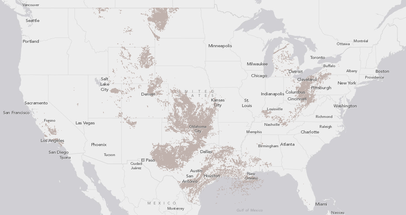
9) The US produces about 60% of the oil it needs
This map shows every oil well in the lower 48 states (there are also quite a few in Alaska, although they're not shown):
It's worth noting that US oil production is actually growing — and fast.
US Oil production is growing fast
By November 2013, the United States was producing 7.8 million barrels of crude oil each day, the most in a quarter-century. Oil production is now expected to keep growing until it reaches a peak of 9.6 million barrels per day in 2019.
Why the uptick? New fracking and horizontal drilling techniques have allowed oil companies to extract more oil from shale rock and other difficult formations. Advances in offshore drilling have also played a role.
That also means US oil imports are slowly shrinking. In 2012, the US relied on foreign countries for about 40 percent of the oil it uses. That's expected to keep shrinking in the decades ahead, as both domestic production increases and consumption drops (the US economy is becoming more oil-efficient and the growth in driving has slowed).
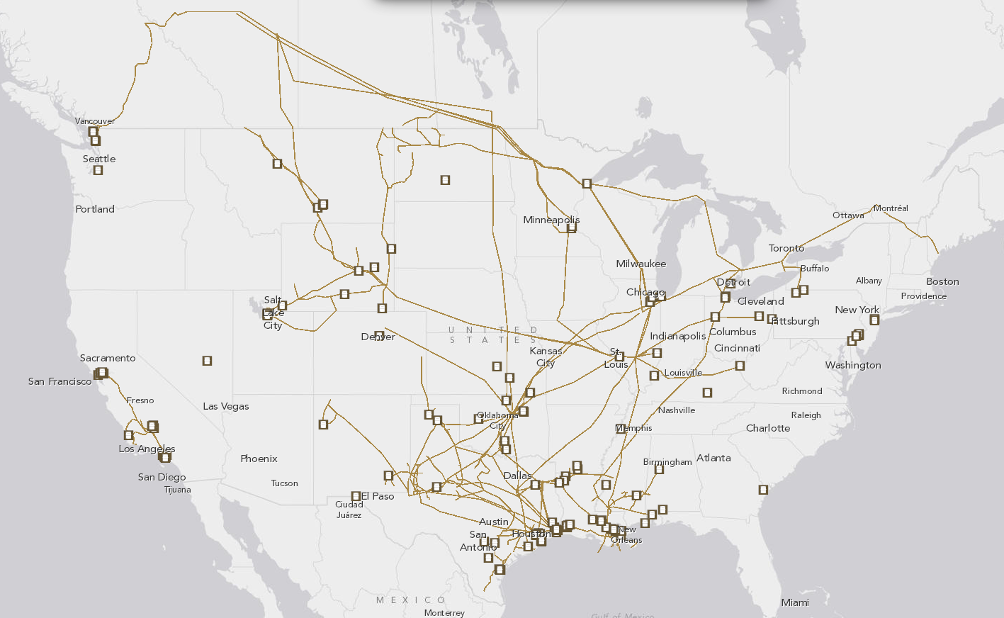
10) But that oil first has to make it to refineries to be useful
This map shows the pipelines that take oil to refineries (shown in squares), which refine oil into gasoline and other fuels for our cars, homes, airplanes, and so forth.
This map can also help shed light on a number of contemporary energy disputes.
For instance, a lot of oil is being dug up from the tar sands in Alberta, Canada. But there aren't enough pipelines (or railways) to bring that oil to refineries. That's why oil companies (and Canada) want to build the Keystone XL pipeline — to bring that tar sands oil down to refineries in Texas.
Oil companies have also argued that there's not enough refining capacity down in Texas to handle the recent boom in oil production in North Dakota and elsewhere. They'd like to lift the longstanding ban on exporting crude oil from the United States — in order to boost the price.
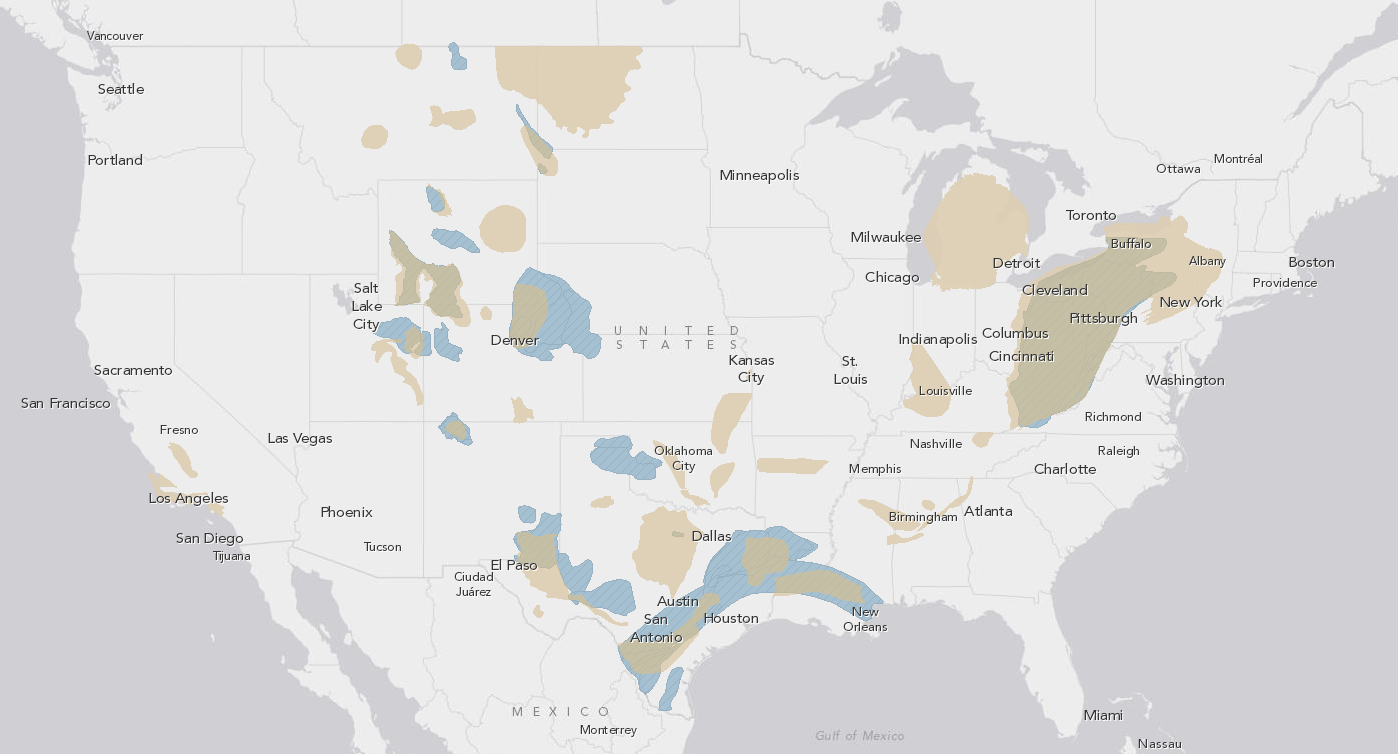
11) The shale boom is upending the US energy landscape
This map shows shale plays of oil and gas (in brown), as well as tight gas plays (in blue):
The rise of new fracking and horizontal drilling technologies has made many of these resources newly accessible. There are currently more than 63,000 shale oil wells and shale gas wells around the country. Much of the activity is concentrated in Texas, North Dakota, Louisiana, and the Marcellus Shale region in the East.
There are more than 63,000 shale oil and shale gas wells
The shale boom has reshaped the American energy landscape. Domestic production of oil and natural gas has risen sharply, leading to cheaper energy and a reduced reliance on imports.
Advocates often argue that fracking is creating jobs, boosting manufacturing, and helping to tackle global warming by reducing the amount of coal we use. Opponents often argue that the industry is poorly regulated, the global warming benefits are overhyped, and that fracking has led to increased air and water pollution around the country.
(You can read about the shale boom — and its consequences — in much, much more detail in our fracking card stack.)
Update: Added "contiguous" to some of the captions here, since that's obviously what the maps show.
Read This
- The jobs where you could be making more money, in one chart
- The way we board airplanes makes absolutely no sense
- Why you shouldn't drive slowly in the left lane
- This map shows the most liberal and conservative towns in your state
- Get ready to pay more for whiskey soon thanks to this merger
- Why you should vaccinate your kids, in two minutes

No comments:
Post a Comment
Please leave a comment-- or suggestions, particularly of topics and places you'd like to see covered